Docklands Taekwon-Do
Designing a trust-first experience that converts interest into enrolment.

Overview
Docklands Taekwon-Do, a long-established martial arts school in South East London, has a legacy of producing national and international champions under the leadership of an instructor with over 30 years of experience. Despite this impressive offline reputation, the website failed to communicate this credibility effectively. While users were visiting the site, they weren’t taking action. The problem wasn’t visibility, it was conversion.
Goal
Design a user experience that fosters trust and encourages prospective students, particularly parents, to quickly understand the offer and book a trial class.
Role: UX + Brand Designer
Timeline: 6 weeks
Client: Founder of Docklands Taekwon-Do

Previous home page

Current home page
The Problem
Parents weren’t browsing the site casually. They were arriving with intent: understand the programme, decide if it felt trustworthy, and book a trial class. The experience didn’t support that decision-making process.
Key information like class times and pricing was difficult to find. There were no meaningful trust signals, no testimonials, no visibility of the instructor, no sense of community. On mobile, the primary call to action wasn’t even visible without scrolling.
In essence, while the site provided information, it didn’t build confidence, and without confidence, users won’t act.
Understanding What Builds Trust
I conducted a competitive analysis to compare other Taekwon-Do school in London to understand existing UI patterns, and identify areas of improvement. What stood out to me was that the best sites didn’t just give information, they built trust. They showed real students, highlighted the instructors’ credentials, and displayed testimonials right on the homepage. They made important details like pricing, class schedules, and location easy to find and understand.
Docklands Taekwon-Do already had all these elements, they just weren’t visible. This became the opportunity: I didn’t need to create something entirely new, but rather to make what already worked stand out so prospective students could easily see what made the school credible and trustworthy.

Listening to Users & Mapping the User Flow
To dig deeper, I conducted user interviews with seven parents. I asked them to explore the site and determine if the school was right for their child and book a trial.
What stood out wasn’t confusion, it was hesitation. Parents were time-poor, browsing on mobile, and making decisions quickly. If they couldn’t find key information fast, they left. Trust was also a major concern. Parents needed to feel confident about the school, but the site didn’t provide enough trust signals.

Mapping the user flow confirmed this. Participants were dropping off during the booking process, especially where clarity and trust were missing. Each point of hesitation was an opportunity to reduce friction, build confidence, and guide decisions more smoothly.
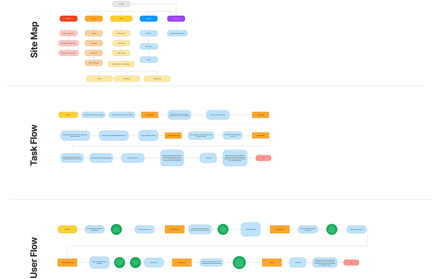
A key challenge I faced was designing the booking and decision-making flow: how could parents quickly find class schedules, view instructor credentials, read testimonials, and confidently book a trial class? On the old site, this information was buried, creating friction that blocked conversions. I knew that based on established design patterns and user expectations, a trust-first approach was essential.
Reframing the problem
This wasn’t a content issue, it was a decision issue. The question wasn’t: What should we add? It was: How do we help users feel confident enough to act quickly?
Users weren’t endlessly comparing schools, they were making fast, decisive judgments. My goal was clear: surface the school’s credibility and community right away, simplify navigation, and reduce the number of steps in the booking process.
Designing for Decision-Making
I approached the redesign as a journey, not just a set of pages. Each step needed to answer a key question at the right moment: What is this? Is it right for my child? Can I trust it? What’s next?
By mapping out the user flow, I pinpointed exactly where users were getting stuck. For instance, the booking flow was originally 7 steps, which I reduced to 3. This wasn’t about removing functionality, but removing decision overload. Every step that forced users to pause and think, rather than act, was a potential exit point.
I worked backwards from the core goal:what information does a parent need to confirm a trial booking?
From there, I focused on building the essential. I also restructured the navigation so key information, classes, schedule, pricing, location, could be accessed in just two taps. This wasn’t about a cleaner design, but about optimising the user flow and minimizing friction so users could make decisions with confidence and speed.

Low- fidelity design on early concepts of content layout and dialog components.
Designing for Trust
Building trust was at the core of every decision. I replaced generic stock images with real photos of students sparring, practicing, and interacting. I brought instructor credibility to the forefront, making it visible on the homepage, rather than buried in secondary pages. Testimonials were strategically placed at key moments when users were most likely to hesitate.
Iterating with Testing
In my project timeline, I planned two rounds of usability testingin order to focus on different learnings and drive fast iteration. During the first round of concept testing, I watched users navigate the site and noticed a subtle but critical issue: 3 out of 5 participants copied the venue address into Google Maps instead of using the site. This revealed a gap in the user flow—users were leaving the page at a key decision point, risking drop-off.
To address this, I embedded an interactive map directly on the site, allowing users to confirm the school’s location without interruption.
This change was small in implementation but high in impact: it kept users confident and the journey seamless, turning a point of friction into a moment of clarity.


High- fidelity designs


The Impact
The redesigned site didn’t just look cleaner, it worked harder for the user. By surfacing trust signals early on, simplifying the booking process, and optimising navigation, we saw a noticeable increase in conversions.
Key Results:
-
Booking flow reduced from 7 steps to 3, improving conversion.
-
Key trust signals (instructor profiles, testimonials, real images) integrated to build user confidence.
Reflection
This project reinforced how I approach design: users don’t need more information, they need confidence in the information they have. When you design for decision-making, not just content, everything changes. The interface becomes a tool to remove doubt, build trust, and make the next step obvious, that’s what turns interest into action.
The key lesson was that research drives design, not assumptions. Parents described the old site as “anonymous”, it didn’t feel like a real place with real people. My familiarity with the school could have biased my choices, but testing with real users revealed friction points I hadn’t noticed.
Small, targeted fixes, embedding Google Maps, surfacing trust signals, and simplifying the booking flow, produced outsized results. Defining success metrics upfront would have sharpened insights, but even simple interventions significantly increased user confidence and conversions.
Future Work
The redesign established a strong foundation, but there are clear opportunities to continue improving trust, conversion, and community engagement:
-
Performance Tracking: Event tracking on CTAs, form starts, and location page visits to guide the next iteration.
-
Social Media Strategy: Extend the brand identity with authentic behind-the-scenes content, proven to influence decisions in the consideration phase.
-
Merchandise as Brand Extension: Branded kit bags, hoodies, and caps create revenue and turn students into local ambassadors, leveraging the school’s community for referral growth.